Brand Identity, Website Design & Custom Platform Development
Maman Sereine is a care-based service operating in a deeply human space: childcare, household support, and elder care. The digital presence needed to do more than inform — it had to reassure, guide, and support trust at every interaction.
This project was developed as a full digital system, combining brand identity, website design, and a custom internal platform into one cohesive experience (Visit Maman Sereine website).
Did you create your logo using an online tool, AI platform, or design app? That’s completely valid — it’s often the first step in shaping your brand. However, most DIY logos are delivered as low-resolution images, which means they don’t scale cleanly, can’t be reliably printed, and quickly show limitations when applied across websites, social media, or marketing materials.
I treat your existing logo as a creative foundation, not something to discard. By rebuilding it as a true vector logo, I refine proportions, line consistency, and spacing so it functions properly across all formats — digital, print, large or small.
Brand Identity & Visual System
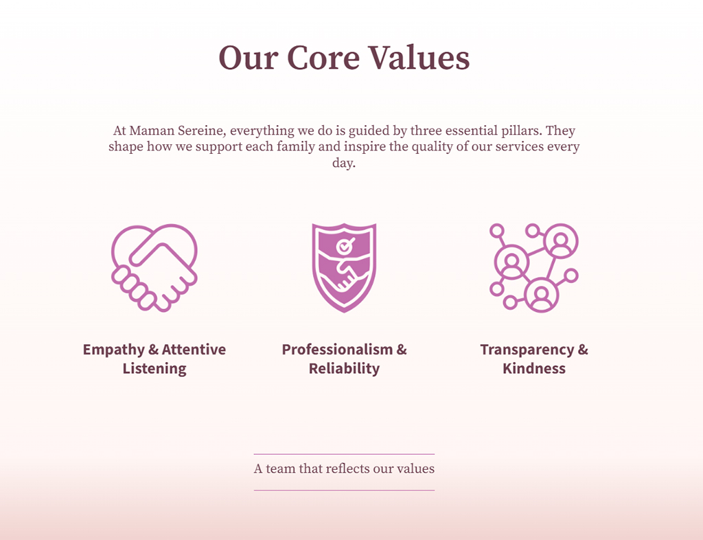
The visual identity was designed to communicate care, calm, and reliability without feeling fragile or generic.
Soft Gradient as a Core Brand Element
A defining feature of the brand is its gentle vertical gradient, blending warm rose tones into lighter blush hues. Rather than acting as decoration, the gradient functions as a structural design element across the site and brand materials.

- Introduces depth without visual noise
- Softens large sections and transitions between content
- Creates emotional continuity from one page to the next
The gradient subtly reinforces the brand promise: continuity, warmth, and a nurturing transition from care to comfort .
Care-based services often struggle with visual identities that feel either too clinical or too sentimental. Many brands rely on flat colors and generic imagery that fail to convey warmth, trust, and professionalism at the same time.
A soft vertical gradient was introduced as a core brand element, blending warm rose tones into lighter blush hues. This gradient adds emotional depth without visual noise, creating calm transitions across pages and materials while reinforcing continuity and care
Colour & Typography Choices
The palette balances soft rose, blush, and muted violet tones, chosen to remain readable, accessible, and professional across screens and print.

Typography pairs:
- Source Serif Pro for warmth, credibility, and human tone
- Forma DJR Micro for clarity, structure, and interface elements
This contrast allows the site to feel both emotionally present and operationally precise.
Website Design & User Experience
The website was designed as a guided experience, especially for users navigating emotionally charged decisions.
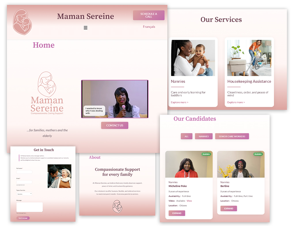
Clear, Modular Page Structure
Each section — services, candidates, contact, application — follows a consistent visual logic:
- Soft section backgrounds to reduce cognitive load
- Card-based layouts for services and candidates
- Strong typographic hierarchy for fast scanning
This structure allows users to explore without feeling overwhelmed.
Bilingual Architecture (FR / EN)
The site was built from the ground up with a true bilingual structure, not a surface-level translation. Navigation, content flow, and calls-to-action were designed to remain natural and culturally aligned in both languages.
Visitors arriving on care-service websites are often making emotionally charged decisions. Dense layouts, harsh contrasts, or overly busy pages increase cognitive load and reduce trust.
The website was designed with generous spacing, soft section backgrounds, and clear typographic hierarchy. Card-based layouts allow information to be scanned comfortably, while muted tones reduce visual stress and guide attention naturally.
Candidate Directory as a Trust Tool
The “Nos Candidats” section was treated as more than a listing — it is a trust-building interface.
Each candidate card presents:
- Role and experience at a glance
- Availability status (clearly visible)
- Location and media indicators
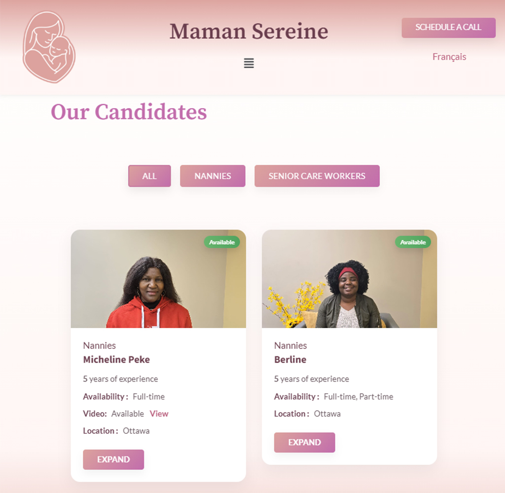
Filtering options allow visitors to narrow candidates by service type, reinforcing transparency and confidence in the selection process.
Families want reassurance, not just options. Traditional candidate listings often hide availability, experience, or role clarity, forcing users to ask basic questions later.
The candidate directory was designed as a **trust-first interface**, surfacing availability, experience, role, and location at a glance. Filters allow users to narrow results intuitively, reinforcing transparency and confidence.
Custom Staff Application & Dashboard
Beyond the public site, a custom staff application was developed to support internal operations.
Staff Dashboard Features
The dashboard allows authorized staff to:
- Add, edit, archive, and manage candidates
- View candidate status and roles in a structured table
- Print active candidate lists for internal use
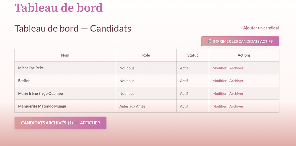
The interface was intentionally kept simple and readable, designed for non-technical users who need efficiency, not complexity.
Many organizations rely on fragmented tools or overly complex admin panels that slow down internal workflows and overwhelm non-technical staff.
A custom staff dashboard was built directly into the website, offering only what staff actually need: candidate management, status updates, and printable lists — all presented in a clean, readable interface.
Design Philosophy in Practice
Throughout the project, every decision followed three principles:
- Reduce friction — visually and functionally
- Reinforce trust — through clarity and consistency
- Design for growth — scalable structure, not one-off pages
The result is a platform that feels calm on the surface, yet is carefully engineered underneath.