Shedding Light on the Invisible: A Thermal Perspective on Homelessness in Ottawa
This self-initiated project explores the power of visual storytelling through conceptual infographics, using thermal imaging aesthetics to represent homelessness—an often overlooked crisis hidden in plain sight.
Strategic Data Synthesis
Infographics are more than just charts; they are a translation of raw data into public understanding. I began this project by extracting critical statistics from the Ottawa 2024 PiT Report, distilling complex findings into a clear, narrative-driven structure that highlights the scale of the crisis.
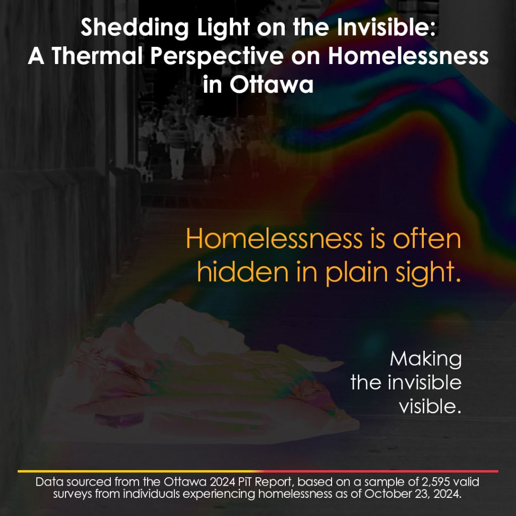
The Thermal Metaphor: Visibility & Heat
To move beyond standard bar graphs, I utilized a thermal imaging aesthetic. This visual metaphor represents how homelessness is often “invisible” to the naked eye but possesses a high emotional and social “heat.” High-contrast typography and bold color grading ensure the data commands attention and demands a response.
While currently a static infographic series, this concept lends itself to potential motion graphics applications, offering an opportunity for dynamic storytelling and expanded engagement.
Human-Centric Data Design
By segmenting the data through Gender, Race, Age, and Sexual Orientation, I ensured the infographics tell a human story. This approach prevents the audience from seeing “just numbers,” instead highlighting the specific vulnerabilities and diverse realities of those experiencing homelessness in our community.
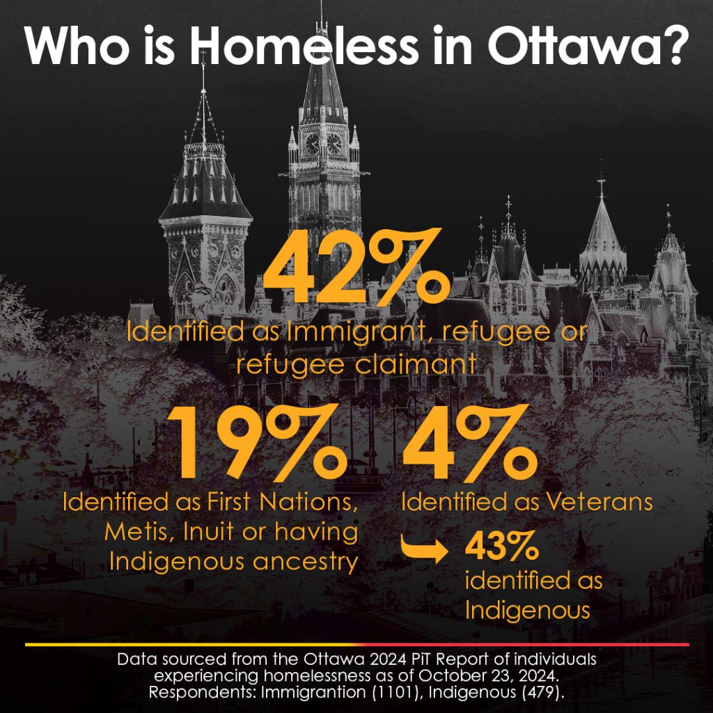
Infographic: Who is Homeless in Ottawa?
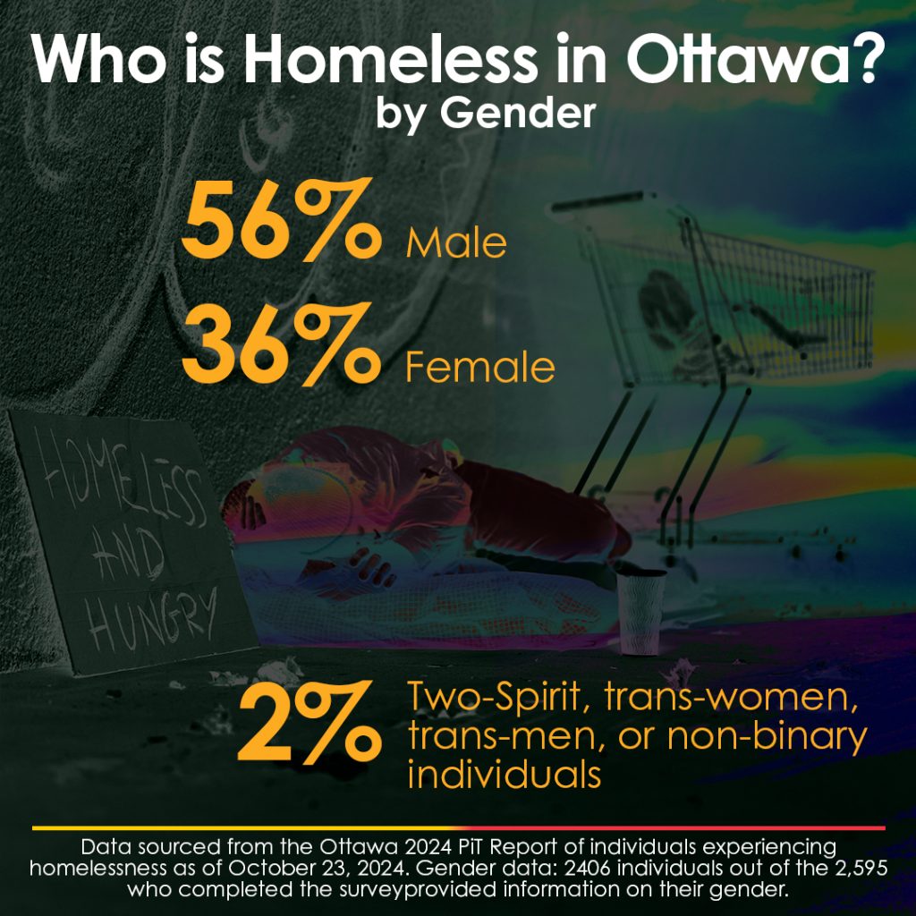
Infographic: Who is Homeless in Ottawa? by Gender
Infographic: Who is Homeless in Ottawa? by Age

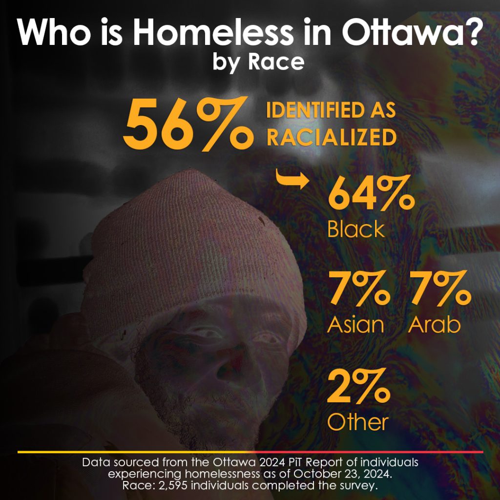
Infographic: Who is Homeless in Ottawa? by Race
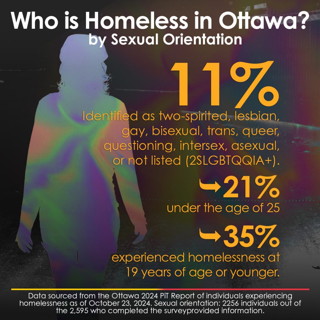
Infographic: Who is Homeless in Ottawa? by Sexual orientation
Design for Impact & Advocacy
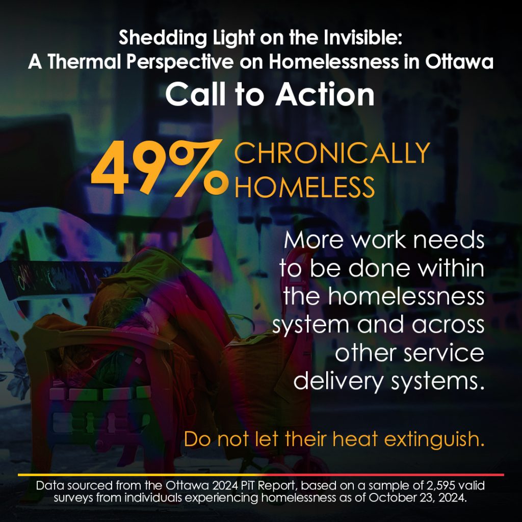
Every piece in this series concludes with a Call to Action. This demonstrates my ability to design not just for information, but for impact—bridging the gap between data-driven awareness and meaningful community engagement.
Infographic: Call to Action