Book Design: Transforming Your Print Vision
Designing a memoir is not just about layout—it’s about shaping a reading experience that respects both the story and the reader. This project focused on clarity, comfort, and thoughtful production from manuscript to final print.
Project Overview
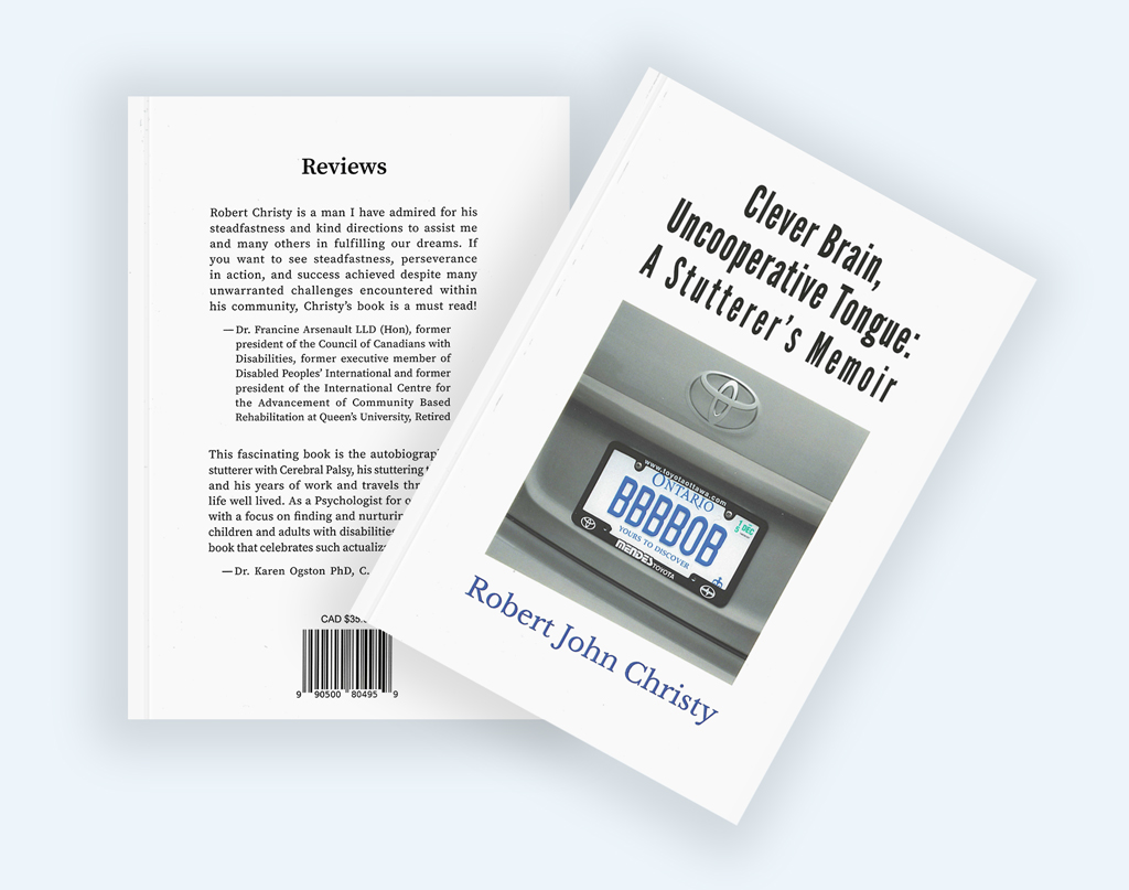
Clever Brain, Uncooperative Tongue is a memoir by Robert John Christy, chronicling a life shaped by cerebral palsy, stuttering, work, travel, and persistence.
The project required more than visual design—it demanded careful typographic judgment, production planning, and a deep consideration for long-form readability.
The final book spans 260 pages and was printed locally following proofing and production review.
The Challenge
Books intended for mature audiences are often undermined by default design decisions: small type, tight spacing, and layouts optimized for cost rather than comfort.
Designing for this audience requires a shift in priorities—from minimizing page count to maximizing readability and ease of engagement.
Cover Design
The cover was built around a client-provided photograph, used intentionally rather than decoratively.
- Clean white space to reduce visual fatigue
- Strong, legible title typography
- Image placement that supports the narrative rather than competing with it
The result is a cover that feels direct, honest, and unembellished—much like the memoir itself.
Interior Typesetting & Readability
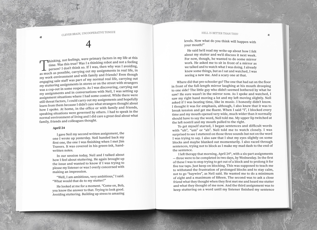
Interior layout decisions focused on long-form reading comfort, particularly for aging eyes.
Key considerations included:
- Increased font size and generous leading
- Careful line length to reduce eye strain
- Clear hierarchy without stylistic distraction
These decisions increased the total page count, but significantly improved the reading experience—a deliberate and informed trade-off.
Print Strategy
Beyond layout, the project included full print coordination support:
- Researching local printers for quality and cost balance
- Preparing and delivering print-ready files
- Reviewing and approving physical proofs
- Adjusting specifications based on real-world output
This ensured the final book was not just well-designed, but well-produced.
Production Support
Outcome
The final book is:
- Comfortable to read for extended periods
- Visually restrained and content-focused
- Professionally printed with attention to detail
Most importantly, it respects both the author’s story and the reader’s time.
Letting the Story Lead the Design
Overdesigned books can distract from the story they’re meant to carry, pulling attention toward styling rather than meaning.
Design decisions here are intentionally restrained. Typography, spacing, and layout are used to support the narrative—not compete with it.