Inside the Story
Motivational Poster Design
Elevating Team Spirit Through Visuals
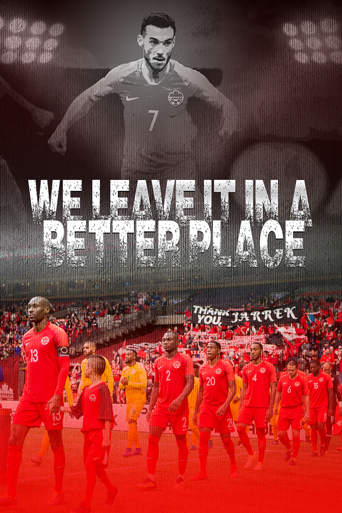
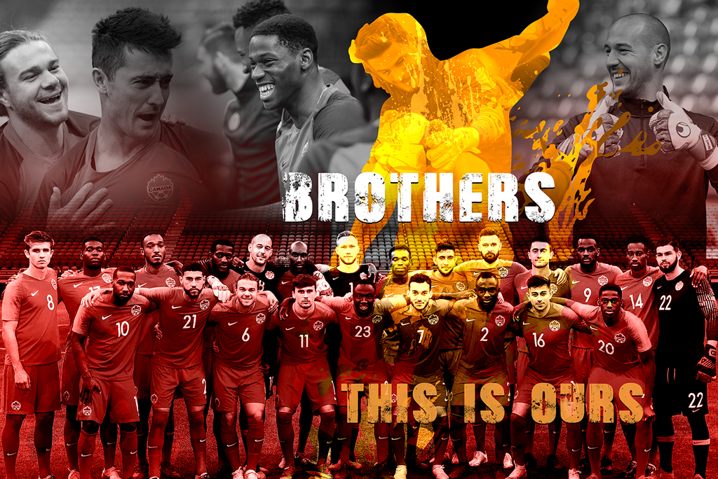
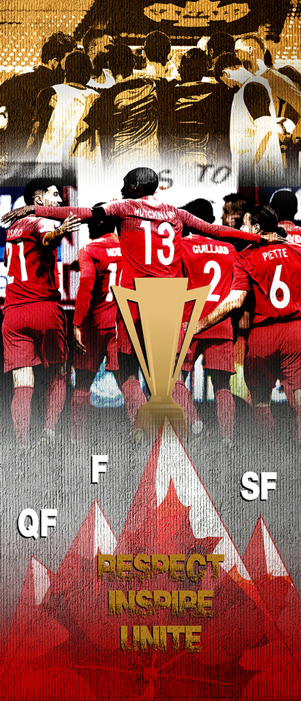
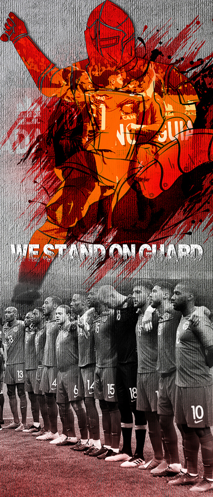
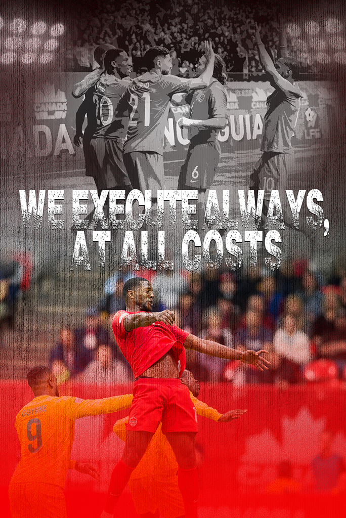
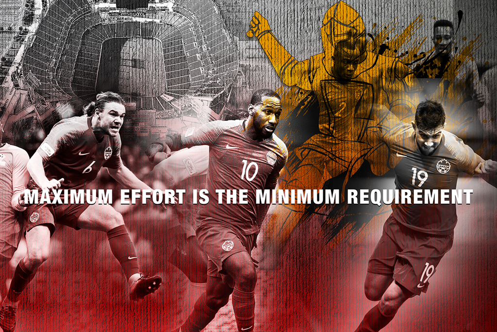
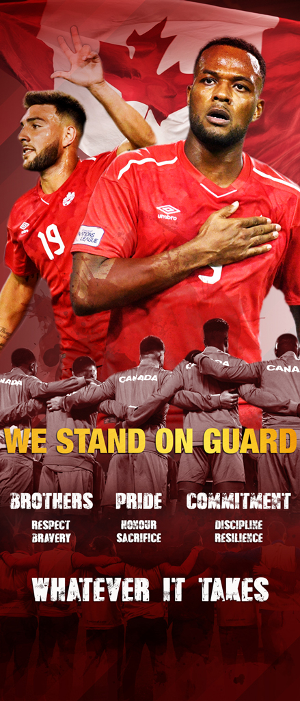
This poster series was created for Canada Soccer’s Men’s National Team to motivate players during their training camp season. The visual strategy combined powerful imagery, bold typography, and rallying slogans to communicate themes of unity, pride, and purpose. Each poster was crafted not only to inspire but also to reflect the identity of the team, reinforcing the message: “We leave it in a better place.”
the poster creation process
Understanding the Brief
Collaborated with Canada Soccer to define the tone and messaging aligned with the team’s goals and training environment.
Establishing Visual Themes
Selected dynamic color overlays, textured treatments, and high-impact slogans for emotional resonance.
Typography with Intensity
Chose bold, distressed fonts to convey strength, endurance, and commitment—enhancing every message on the posters.
Imagery & Layout
Composited photos of players in action with symbolic backgrounds and layered textures to energize the space.
Print-Ready Design
Delivered high-resolution designs optimized for large-format printing and digital use, ready for stadium display and team communications.

Why Poster Design Still Matters
Whether it’s for locker rooms, training fields, events, or community halls—well-designed posters are impactful tools for internal motivation and external branding. They unify the team’s message, build anticipation, and create lasting visual memory. Bold posters leave a legacy on and off the field.
Does Poster Size Really Matter?
Yes — viewing distance makes a big difference. The size of your poster should reflect how far your audience will be standing when reading it. Here’s how to decide:
Smaller Sizes (11×17 in)
Best for close-up settings like bulletin boards, indoor displays, or hallway posters. Ideal when viewers are within 3–5 feet of the display.
Larger Sizes (18×24, 24×36, 36×48 in)
Designed for conferences, event halls, storefront windows, or outdoor displays. Larger formats ensure legibility from 10 feet or more away.
Rule of Thumb
For every 10 feet of viewing distance, increase the text height by at least 1 inch. Combine this with bold imagery, high contrast, and large titles for maximum impact.
Choosing the right size means your message won’t just be seen — it will be understood.
Read: The Ultimate Display Size Cheat Sheet(via Haverford Systems)