Brand Refresh
Brand refresh services provide organizations with a branding strategic update to their visual identity, ensuring relevance, consistency, and impact in a competitive landscape. Whether refining an existing logo, modernizing typography, or developing comprehensive brand guidelines, this process enhances brand recognition and strengthens communication across all platforms.
Saskatchewan Soccer Association Brand Refresh
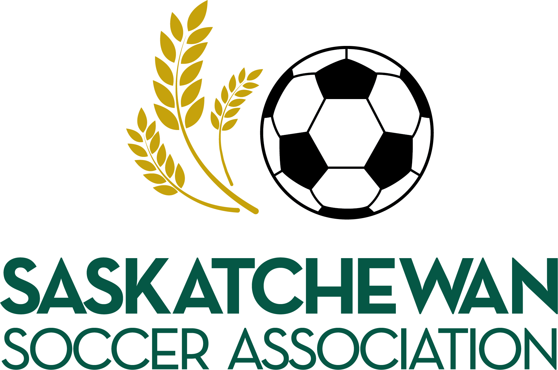
Previous Association logo
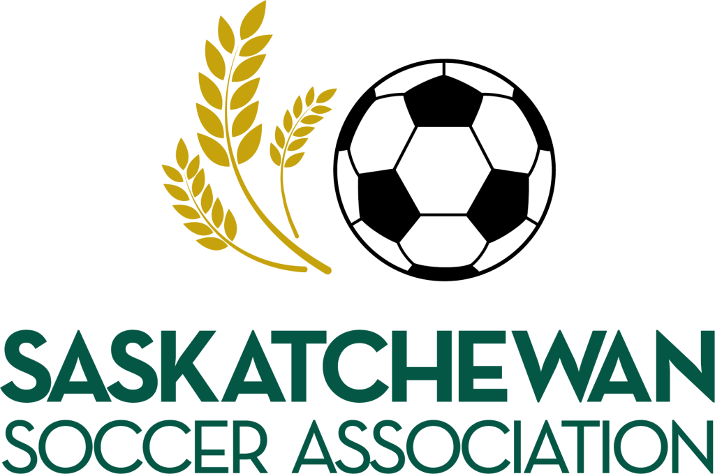
New Association logo
The Saskatchewan Soccer Association (SSA) required a refreshed visual identity that maintained its core values while presenting a more dynamic and modern look. This brand update included refining the SSA logo, typography, and color palette to enhance consistency and adaptability across digital and print platforms. The revitalized design introduced a fresh take on SSA’s identity, integrating vibrant graphic elements, such as the energetic paint splatter and wheat motif, symbolizing Saskatchewan’s soccer community.
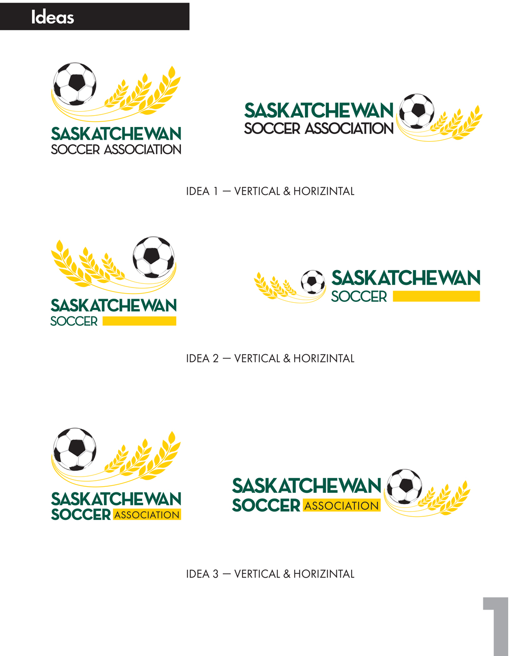
Strategic Audit & Creative Concepts
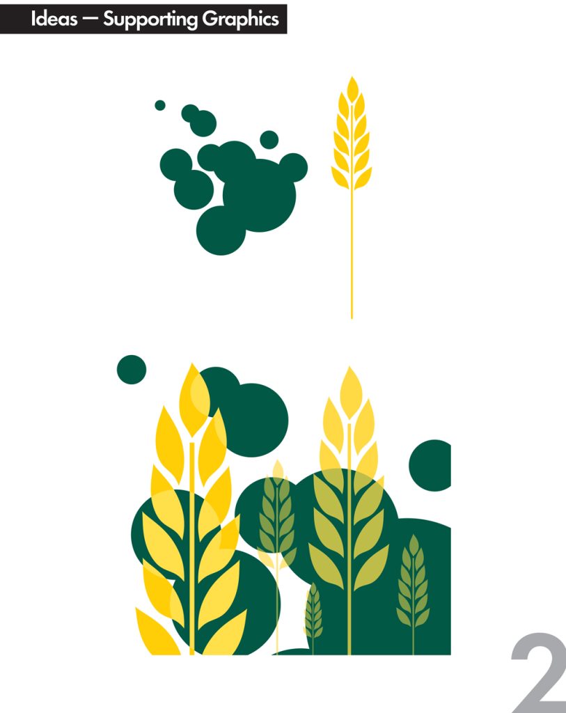
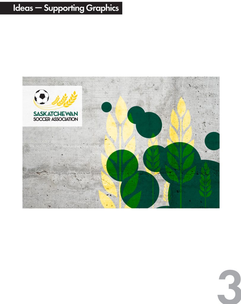
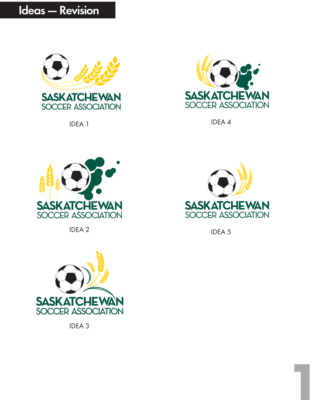
I began by analyzing the Saskatchewan Soccer heritage. This phase involved presenting distinct branding ideas that explored different ways to modernize the wheat and soccer ball motifs, ensuring the new look felt energetic yet familiar.
Branding Ideas presented
Branding Selected idea
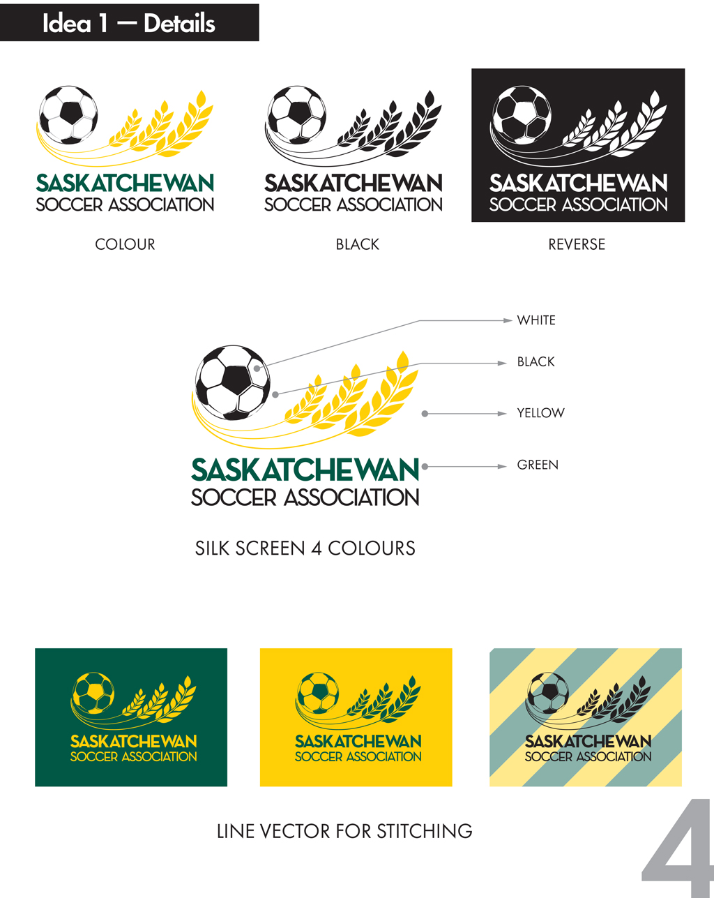
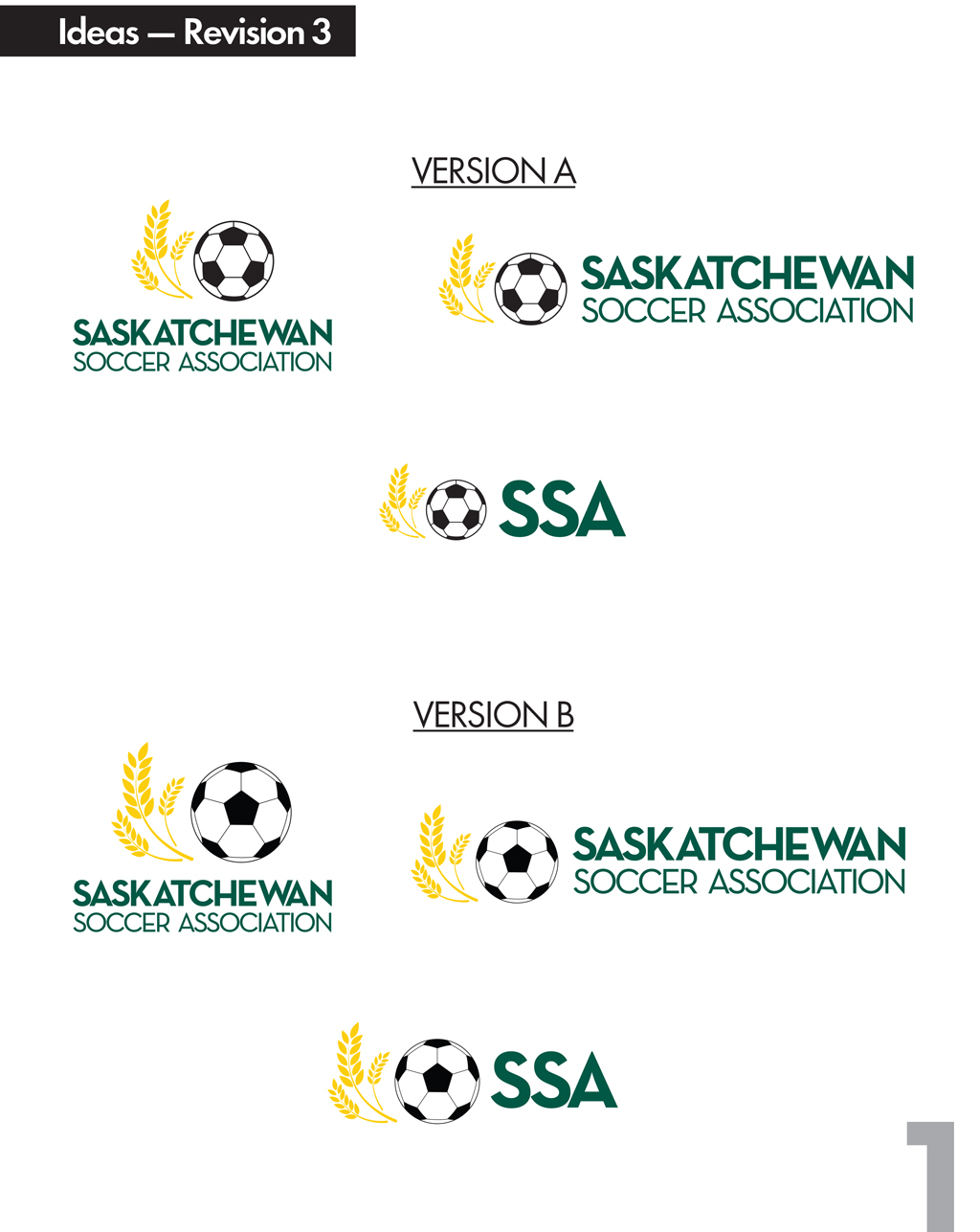
Collaborative Refinement
Branding is a partnership. After the initial selection, I worked through a series of revisions to perfect the line weights, color balance, and typography. This ensures the final mark is not just beautiful, but technically sound for all applications.
Branding Idea selected-Revisions
Scalable Logo Architecture
A modern brand must be flexible. I developed a comprehensive logo system including vertical, horizontal, and acronym-based versions. This allows the SSA identity to remain legible and impactful whether it’s on a tiny social media icon or a large stadium banner.
Branding Final Selection


Vertical logo


Horizontal logo
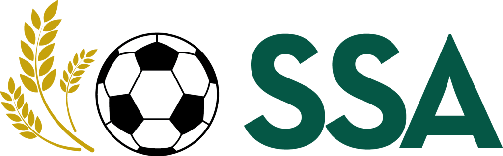

Acronym logo
Symbol
Implementation & Guidelines
The new SSA Visual Identity Guidelines were developed to ensure brand cohesion across all communication materials, including business stationery, reports, social media, and promotional assets. This refresh strengthens SSA’s brand presence, reinforcing its commitment to Integrity, Inclusivity, and Innovation. This manual provides clear instructions on typography, color palettes, and spacing, empowering the SSA team to maintain professional consistency across digital and print media.