
Event Branding for Canada Soccer: Women’s EXCEL Plan 2019
Designing for a national sports organization requires more than strong visuals—it demands clarity, energy, and a deep understanding of the story being told. This project focused on the Canada Soccer Women’s EXCEL Plan – Own the Podium 2019 Review, a 50-page document highlighting the development, performance, and future direction of the Canadian Women’s National Team as they prepared for the Olympic Games. The goal was to create a visual system that communicated movement, teamwork, and national pride, while maintaining the structure and readability expected from a professional report.
Project Overview
The document was designed as a comprehensive review of the Women’s EXCEL program, combining performance data, player development insights, and key milestones.
It required a balance between:
- editorial clarity for structured content
- visual energy to reflect high-performance sport
- brand consistency aligned with Canada Soccer’s identity
The final result is a 50-page publication that functions both as an internal report and an external communication tool.
The Challenge
Sports reports often lean heavily toward dense information, which can make them visually static and difficult to engage with.
The challenge here was to:
- present large amounts of structured information clearly
- maintain visual interest across 50 pages
- reflect the intensity and emotion of elite-level competition
- ensure consistency across multiple page types (text, tables, imagery, highlights)
The design needed to feel dynamic without becoming overwhelming, and structured without feeling rigid.
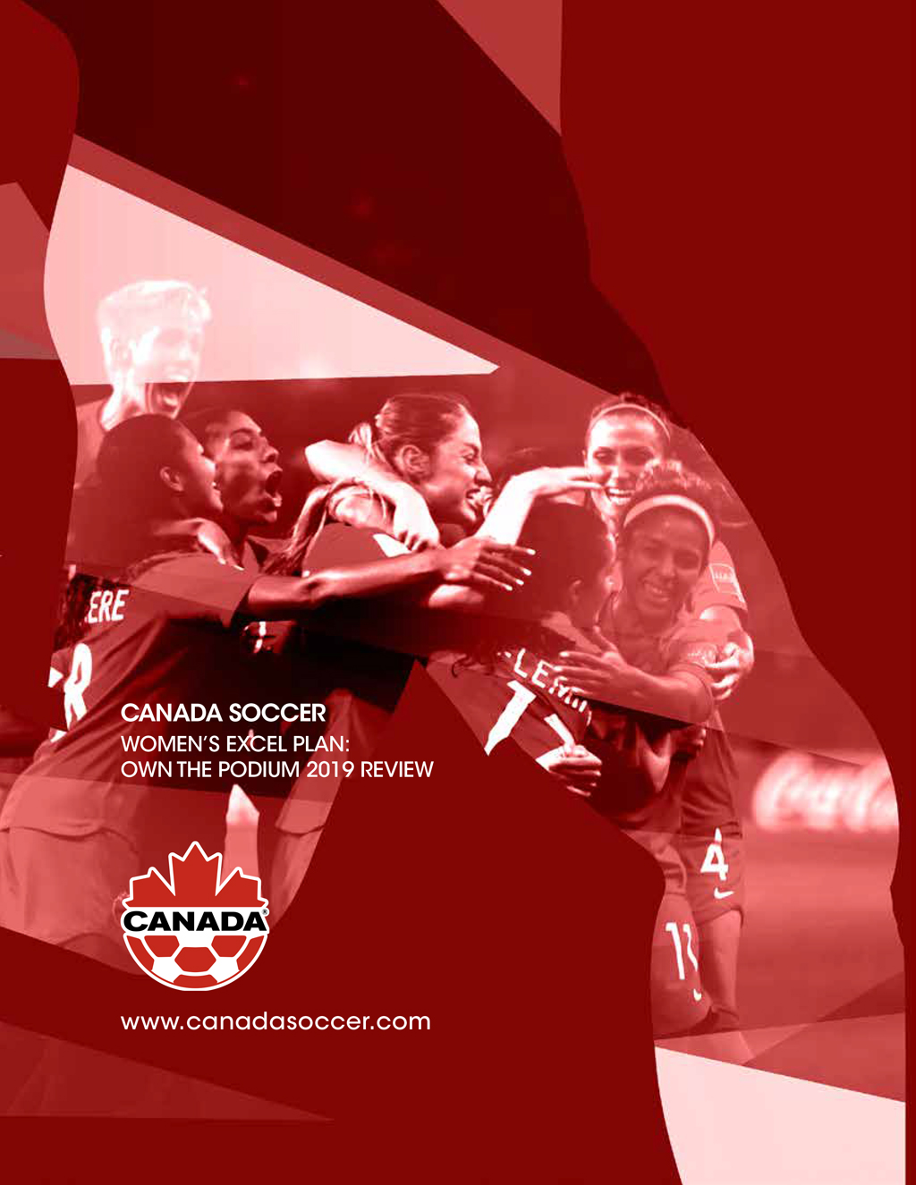
Cover Design
The cover sets the tone for the entire document.
A player silhouette was used as a framing device, enclosing a moment of celebration captured during a winning match. This combination creates a layered visual:
- the silhouette represents structure and identity
- the photograph captures emotion and teamwork
- the red palette reinforces the Canada Soccer brand
The result is a cover that communicates energy, unity, and purpose at a glance.

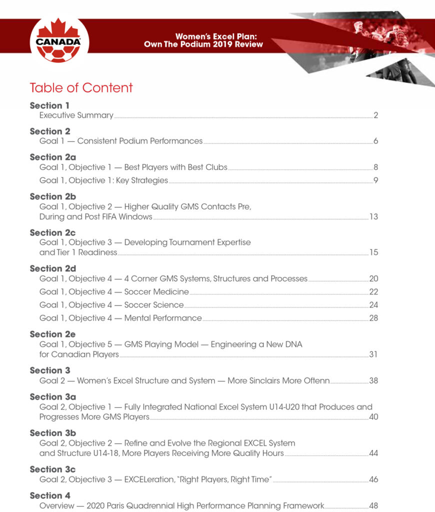
Interior Design and typesetting
The interior layout was built to support both readability and visual engagement across multiple content formats.
Key design elements:
- Clean grid system for consistent alignment
- Strong typographic hierarchy for easy navigation
- Balanced use of white space to avoid visual fatigue
- Integration of photography and graphics to maintain rhythm
Different page types required tailored solutions:
- Table of contents → structured and highly legible
- Data tables → clear comparison and quick scanning
- Feature spreads → bold, graphic-driven storytelling
- Image pages → full-bleed visuals to highlight key moments
Visual Rhythym Across Pages
Maintaining consistency across 50 pages requires more than repeating layouts—it requires rhythm.
The design alternates between:
- text-heavy sections
- image-driven spreads
- data-focused layouts
This creates a natural flow, allowing the reader to move through the document without fatigue while staying engaged.
Outcome
The final document delivers:
- a clear and structured presentation of complex information
- a visually engaging narrative aligned with high-performance sport
- a consistent brand experience across all pages
- a balance between editorial discipline and visual expression
It supports both internal stakeholders and external audiences by presenting information in a way that is both professional and compelling.
Designing for sport is ultimately about capturing more than results—it’s about translating effort, teamwork, and momentum into a visual language.
This project demonstrates how editorial design and event branding can work together, turning a performance report into a document that reflects both the data and the spirit behind it.